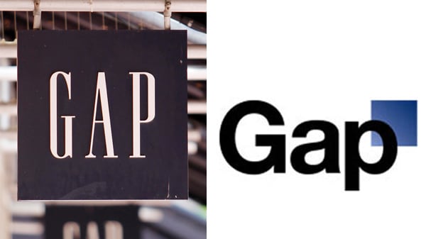
0GAP Logo Redesign and Other Worst Logo RedesignsLess than a week after unveiling a new logo, the Gap caved to consumer backlash and restored its trusted blue-block design. View other logo redesigns gone wrong.Updated Jul. 14, 2017 7:56PM EDT / Published Oct. 12, 2010 10:09AM EDT Alan Diaz / AP Photo GAPAlan Diaz / AP Photo iTunesPaul Sakuma / AP Photo Seattle's Best MTV AOL Ikea Tropicana Best Buy PepsiGetty Images; AP Photo Animal Planet London KFC Mastercard
GAPAlan Diaz / AP Photo iTunesPaul Sakuma / AP Photo Seattle's Best MTV AOL Ikea Tropicana Best Buy PepsiGetty Images; AP Photo Animal Planet London KFC Mastercard