
Trump Lawyers Hammer Pecker During Cross-Examination
PECKING AWAY
Trump lawyers continued their assault on National Enquirer boss David Pecker Friday, trying to find inconsistencies with his story.

The Cringe-Worthy Millennial Sex Comedy Everybody Should See
A NEW KIND OF ANGST
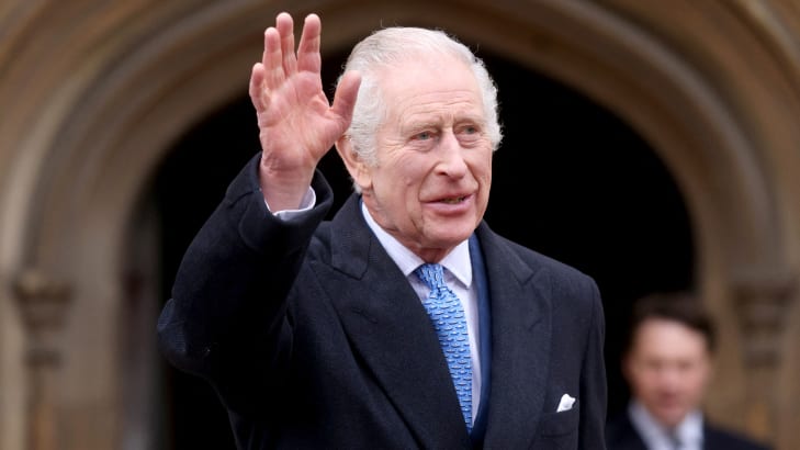
King Announces Return to Duties With Cancer Center Visit
‘MANY KINDNESSES’

Trump Marks Melania’s Birthday, Makes It All About Himself
VERY SPECIAL DAY


CHEAT SHEET
TOP 10 RIGHT NOW
OR
Newsletter
Everything we can’t stop loving, hating, and thinking about this week in pop culture.
By subscribing I have read and agree to the Terms of Use and Privacy Policy.