0
Space Shuttle Enterprise: Icon of 1970s Unstylish Design (Photos)
Function Over Form
From the Pacer to New York’s new Enterprise, a look at the era of anti-aesthetic aesthetics.
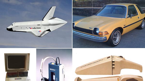
Space Shuttle Enterprise
NASA / Corbis
(Not) Warp Speed Ahead
Courtesy of NASA
The Odd Couple
Courtesy of NASA
The Volkswagen Rabbit
Courtesy of Carroll Gantz, author of "Design Chronicles: Significant Mass-produced Designs of the 20th Century"
The Apple II Computer
The Sony Walkman
Courtesy of Carroll Gantz, author of "Design Chronicles: Significant Mass-produced Designs of the 20th Century"
The Dustbuster
Courtesy of Carroll Gantz, author of "Design Chronicles: Significant Mass-produced Designs of the 20th Century"
The Honda Civic
Courtesy of Carroll Gantz, author of "Design Chronicles: Significant Mass-produced Designs of the 20th Century"
The Cuisinart
Courtesy of Carroll Gantz, author of "Design Chronicles: Significant Mass-produced Designs of the 20th Century"
The Black and Decker Workmate
Courtesy of Carroll Gantz, author of "Design Chronicles: Significant Mass-produced Designs of the 20th Century"
The AMC Pacer
Got a tip? Send it to The Daily Beast here.