
The designer behind the typeface Calibri has laughed at Secretary of State Marco Rubio for thinking his creation is woke.
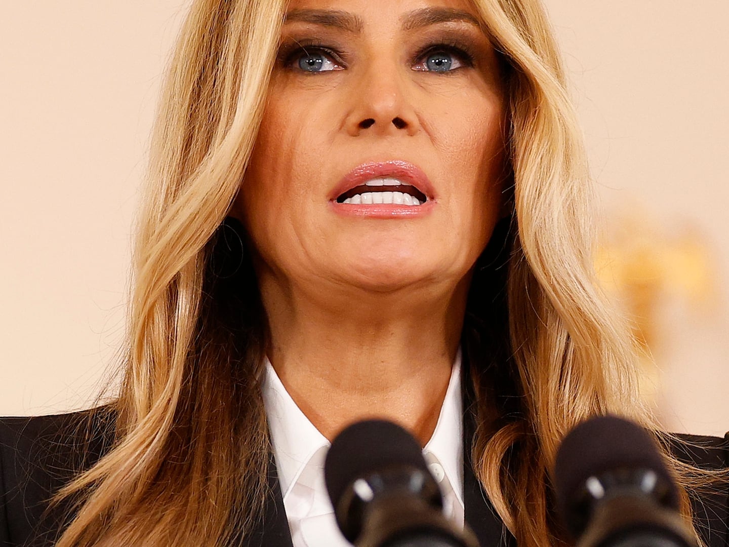
Rubio sent a memo to diplomatic outposts around the world on Tuesday, demanding that staffers return to Times New Roman for official department business because it embodied “tradition, formality, and ceremony.”
He also chastised the “informal” Joe Biden-era alternative that replaced it in 2023, saying then-Secretary of State Anthony Blinken’s switch “to Calibri achieved nothing except the degradation of the department’s official correspondence.”

Blinken introduced the sans-serif typeface on the recommendation of the department’s inclusivity office, which has since been disbanded by Rubio, along with an increase in standard type size to 15-point.
Lucas de Groot, the creator of Calibri, said Rubio’s move is a bad one because he designed the typeface with the primary objective of it being easy to read.
Speaking to The Times of London, he dismissed any suggestion that Calibri is woke, saying the notion was “just humorous to me.”

“It is designed to be friendly,” he said, insisting that Rubio’s reasons for removing it as the official lettering of the department meant he’s done his job well.
“So if Rubio thinks it’s inclusive, he’s right. It’s a compliment, of course,” he said.
“There are thousands of parameters that I use when designing a font to make it more readable,” de Groot added. “I’m not thinking of inclusion. In this case, it was just the assignment to make a very readable font for everybody.”
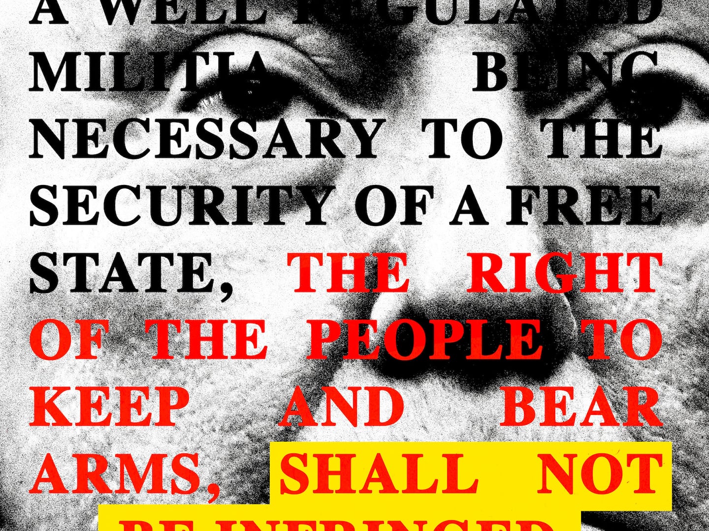
He then aimed a jab at President Donald Trump and his love of all caps social media posts, saying that with Times New Roman, “If you write in capitals like the U.S. administration loves to do all the time, the spacing is really irregular. Some letters are very tight, very close together, other letter pairs are very loose, far apart. And this gives a very unprofessional look to the serif font.”

The State Department confirmed the switch to the Daily Beast, affirming it was also reducing the official type size to 14-point.
Sans-serif typefaces, found in Daily Beast headlines, do not have flicks at the ends of letters and numbers and are regarded as a modern alternative to more traditional serif typefaces, as the Beast uses in the main body of its articles.
While Blinken’s switch to a larger sans-serif was designed to make reading State Department documents easier for all, for people with disabilities Rubio’s reversion is a step in the wrong direction.
“Ending the State Department’s use of accessible, sans-serif fonts like Calibri is more than a shift in design preferences—it is a direct step backward for millions of people with low vision who rely on digital accessibility features to read vital information,” Maria Town, President and CEO of the American Association of People with Disabilities, told the Daily Beast.
“San serif fonts make State Department information more accessible for the agency’s employees and for the millions of disabled people around the globe who rely on State Department information to inform their work and travel.”
She added, “At a time when families across the country are struggling to afford the basic necessities of life, eliminating accessibility features should be the very last thing our government is concerned with. We strongly urge the State Department to maintain Calibri or another sans-serif font as its designated font to keep its information as accessible and usable as possible.”
Rubio’s removal of accessibility measures comes as part of a wider Trump administration push to end what it regards as a woke crisis, sything down countless diversity, equality, and inclusion programs, offices, grants, and more.
The Daily Beast has contacted the State Department for further comment.