“It doesn’t even look like her.”
That one comment, culled from thousands online about Baltimore artist Amy Sherald’s portrait of Michelle Obama unveiled today at the Smithsonian Institute’s National Portrait Gallery, sums up a familiar response to the public’s often less-than flattering responses to portrait painting.
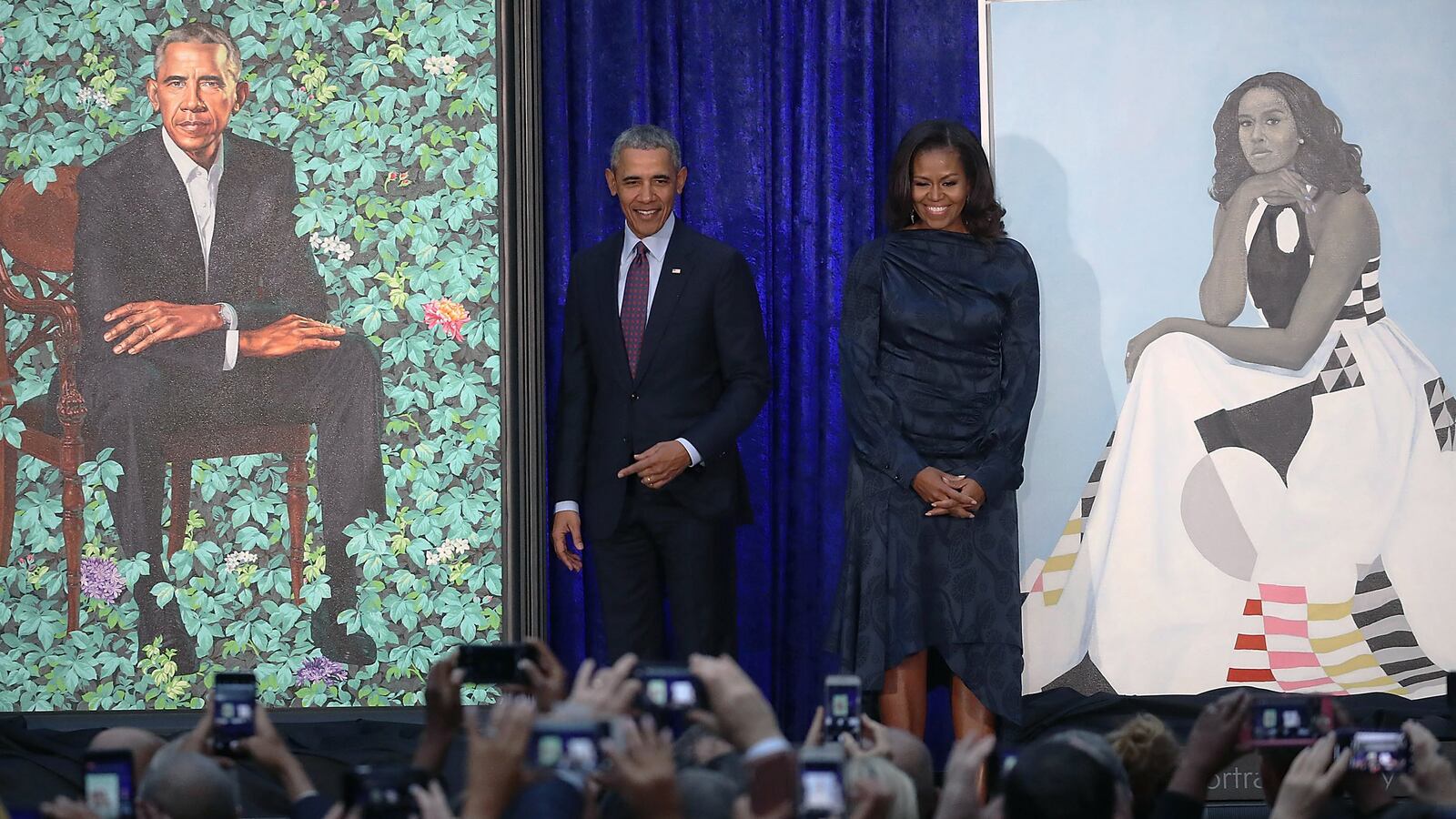
In the portrait, Mrs. Obama sits in a custom dress designed by Milly’s Michelle Smith of bold geometric shapes, her expression challenging the viewer. Her face and skin are grey, as Sherald often paints her subjects.
It doesn’t look exactly like her, it doesn’t look exactly not like her. It is a representation of Mrs. Obama, who sat for Sherald the artist, and the responses to the result sum up the tension between artist and sitter and artist and spectator, too.
Holland Cotter, art critic for the New York Times, said Mrs. Obama’s portrait face was too far removed from the real one.
“To be honest, I was anticipating—hoping for—a bolder, more incisive image of the strong-voiced person I imagine this former first lady to be,” Cotter wrote.
This gets at the central tension of the art of the portrait. Just how much should a portrait be about physical likeness, versus conveying psychological truth, or an insight into character? The furor over Michelle Obama’s portrait suggests we want a portrait to deliver the first above all else.
Other commenters have remarked that Mrs. Obama’s skin is not “black enough,” or her arms toned in the right way. Sherald is an African-American artist who only draws African-American subjects, and the way she does that isn’t to represent their skin tones as they appear.
What people’s kvetching comes down to: this painting isn’t enough like a photograph. The spirit that Mrs. Obama represented to so many seems lacking in the more restrained, removed spirit of Sherald’s work. But the public face of Michelle Obama isn't the only face. Sherald is arguably trying to show us another face.
We live in such a literal culture and such a visual culture, a world of selfies and relentless photographic capture, there are howls when an official portrait simply does not do the same job. There is an exasperation with painting that it has done what it has always done—taken artistic liberty, sought to burrow behind the photograph’s surface—instead of simply doing what a photograph does, which is to render the familiar even more familiar.
In this sense, Kehinde Wiley’s accompanying portrait of Barack Obama is seen as more successful. It looks more like the photographic Barack Obama we know. Here, any outrage voiced seems to have been about the background, which features flowers from three significant places to him: Kenya, Hawaii and Chicago.
"I tried to negotiate less gray hair and Kehinde's artistic integrity would not allow (him) to do what I asked," Obama said. "I tried to negotiate smaller ears. Struck out on that as well."
Both painters aimed to do something beyond simple replication for their portraits. The backdrop of a bush, or garden, endows Barack Obama with a literal life force. The garden is green and vibrant behind him. The setting is entirely complimentary to his persona; in the painting he is sitting forward, alert. He is fixing us with a wizened glare. This garden is pure Obama Zen.
Mrs. Obama’s portrait is starker, and psychologically richer. "Amy, I want to thank you for so spectacularly capturing the grace and beauty and intelligence and charm and hotness of the woman I love," Mr. Obama said.
Mrs. Obama said she hoped "girls and girls of color" would “see an image of someone who looks like them hanging on the walls of this great American institution ... And I know the kind of impact that will have on their lives because I was one of those girls.”
In her remarks, Mrs. Obama acknowledges what her portrait’s detractors do not; that a painting such as this is a distillation rather than impersonation. It is the person’s spirit in the moment of sitting, rather than a literal embodiment of that person.
Sure, you have to get past something that doesn't look like the person on TV or in a magazine. But once you've done that, a portrait—even one that has a visual disconnect, perhaps especially one that has a visual disconnect—can make you see the subject anew.
There are so many photographs of the Obamas, why do people expect paintings simply to add to the plenitude of likenesses of them? Still, if today has shown us anything it is that photography has not supplanted painting as an artform, if two paintings can inspire such passionate opinions.
Indeed, the anger aimed at painters is often more forceful than photographers. Painting is seen as posterity, forever, immutable. Get a photograph wrong, and you can delete it or select from a hundred more; get a painting wrong in the public’s eye and it is not so easily deleted. It literally just hangs there. The upside of that seeming permanence is that more time spent with a painting may yield a more embracing range of interpretations.
The Obamas are not alone in facing the public’s confusion after the release of an official portrait. The Queen has been painted and photographed many, many times; Lucian Freud’s head-and-shoulders portrait of her was reviled by some (others might see a work of great psychological depth), as was Dan Llywelyn Hall’s portrait of her in a red dress. (That really was terrible.)
It's unlikely that the Obamas will dislike their portraits so much, they will— as Winston Churchill's wife Clementine is reputed to have done—burn them (as Clementine supposedly did to the one of her husband painted by Graham Sutherland).
If you really feel that Michelle Obama’s portrait is a dud, the queen got it far worse in George Condo’s portrait of her, envisioning her with a huge neck and bulbous cheeks and chin. A Cabbage Patch Doll, scoffed the critics.
You may not think Michelle Obama looks much like herself in this new portrait, she may not be the public Michelle Obama you have seen and responded to, but at least she doesn’t look like someone or something else entirely.

