When the cover for double issue of The New Yorker for December 22 and 29, 1997 was published, the illustrator and artist Owen Smith received one letter from a reader saying, “Shame on you. It’s Christmas and you've killed someone on cover of The New Yorker.”

The cover showed one of his familiar, film noir meets pulp-inspired images, with a femme fatale in a red dress on the stairs holding a gun, a man lying dead under the Christmas tree, his body alongside presents on the floor in front of a roaring fire: a self-consciously trashy cover acting as a front for the publication’s distinctly non-trashy writing.
Smith, 53, has designed 19 New Yorker covers, with illustrations featuring more '40s and '50s style femmes fatales in red dresses, and Stanley Kowalski-like hunks in white T-shirt and jeans; Rebels without Causes and strong, unreadable women; lovers, objects of desire, nemeses.

One cover featured soldiers in a World War One trench, one serviceman reading a letter from a loved one via torchlight. A ‘fiction issue’ cover featured another sultry woman with a man lying in bed, books spread over the blanket; another ‘fiction’ issue featured the femme fatale figure sitting at a typewriter while her neighbors caroused out of open windows.
The same femme fatale features again in a Hopper-like restaurant scene, and on top of a human pyramid at the beach.

Away from the magazine rack, Smith – based in Oakland and also a teacher and head of a prestigious college art department – has also designed the panels of a subway station, Brooklyn’s 36th Street.
The panels, commissioned by the MTA, explore the construction of the subway itself and took a couple of years to install. Smith has also designed posters for San Francisco’s transit system.
In 2011 Smith's mosaic murals and relief sculpture panels for Laguna Honda Hospital in San Francisco were named one of America’s Best Public Artworks at the 2011 Americans for the Arts Convention in San Diego.
His art has been displayed in New York, Milan, San Francisco and Los Angeles. As well as The New Yorker, Smith’s illustrations have graced Rolling Stone, Sports Illustrated, Time, Esquire, and the New York Times.
Smith first started contributing to The New Yorker when Tina Brown (founder editor of the Daily Beast) was editor. He reported to Françoise Mouly, the art editor. When The New Yorker first contacted him, he tried to sound as calm and professional as possible, and then “screamed and jumped up and down stupidly” when he hung up. His first cover related to a story about massacres in El Salvador.
It sounds an excruciating, patience-testing process of planning calendars, sketches, and illustrations being commissioned with only one lucky cover winner, and even – on one occasion – one illustrator being commissioned, with Smith then completing the idea.
But the prized end result – a cover in The New Yorker – is worth it. “I do some gallery work too,” said Smith. “It’s never quite that impact. I could do a painting for The New Yorker, send it via email to the art director on Thursday and it could be on news-stands by Saturday. It’s crazy. Several million people see it. You do a gallery show, and you hope 50 people turn up. There is this instant interaction with news and pop culture which is nice, and it’s nice when it’s your idea and your take on things.”

Smith laughed as he recalled receiving the brown envelope filled with readers’ letters responding to Smith’s pulp-influenced illustrations, and that accusation he had ruined Christmas.
In other missives, outraged readers threatened to cancel subscriptions, and accused him of creating art that was more appropriate for Playboy. Why, one correspondent wrote, was he trashing the august institution of The New Yorker.
“I was freaked out,” recalled Smith, “and called Francoise, who was like, ‘Tina’s so happy.’ Because I was pushing some buttons. Tina was trying to make the magazine more acceptable to younger folks.
"In those days there were readers who were outraged old ladies, who were used to those covers of the 1970s and 80s showing a vase of flowers or a beach in the Hamptons. Some were funny, but not topical. Every now and then they slipped in social criticism. But the magazine in the 1920s, 30s, and 40s poked fun at social mores. That went away, and Tina tried to revive it. If it got a little controversy, then that was good.”

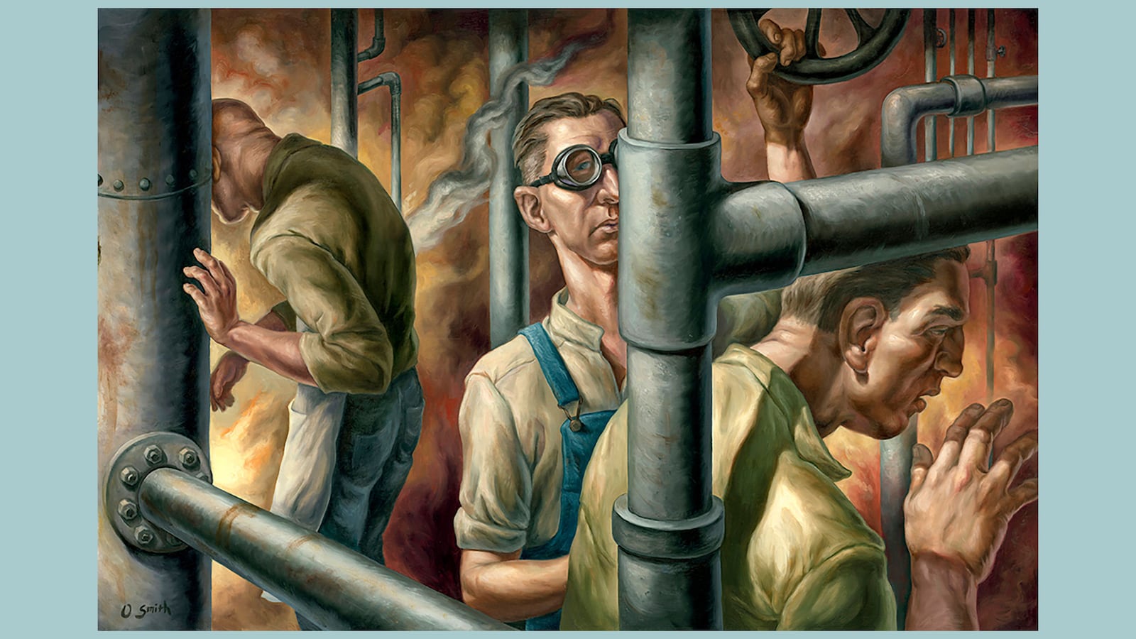
The New Yorker illustrations are, in real life, oil paintings. “I add a drying medium so the paint dries in a couple of days and I can photograph or scan the work and email the image to the client,” said Smith.
Smith’s artistic method is, he said, to paint in oil on wood panel, illustration board, or sometimes canvas.
“The process starts with research. I create pencil ‘thumbnails’ (small exploratory sketches). I move on to more realized pencil sketches--refining the composition and values (lights and darks). When I need to receive approval from a client. I send multiple sketches and sometimes revised sketches until a final selection is made. I’ll take a photo reference to help develop the image.
“I create a final drawing that is transferred to the ‘Gessoed’ (primed-for-painting) surface for painting. When I have time, I may paint some color studies before moving on to the final work. I paint pretty directly. At the end of the process I sometimes use layers of paint (glazes) to adjust color, intensity, and value contrast.”

Smith’s sculpture work is made with either ceramic clay that is fired in a kiln, or oil-based clay from which a mold is made. A finished piece has been cast in plaster or colored concrete. “I’d like to learn to work in wax for eventual metal casting,” he said.
For his mosaic murals, he creates the designs in oil paint, “and then I work with a mosaic fabricator to translate the images into glazed mosaics. An accurate impression is assembled using with small pieces of colored/textured tile.”
Smith grew up, “a west coast suburban kid” in Northern California. His father was a doctor, his mother a music teacher-turned housewife. He was one of twins, with a “probably hyperactive” older brother and an autistic younger brother.
Both Smith and his twin Aaron were artists. They were very close, and also roommates at college “who fought like crazy until we moved into separate classes.”
Today, Smith is the chair of the illustration program of the California College of the Arts in Northern California; and Aaron is Associate Chair of Illustration at the ArtCenter College of Design in Los Angeles. Smith laughed. “Administrative art careers for both of us. It’s annoyingly twin-like. We’re pretty close in a lot of ways. We do annoying things like finishing each other’s sentences.”
Growing up, Smith was the better driver, Aaron more social. As they aged, his brother leaned more towards fine art. “I have a wife, two kids, a dog and two cats, and he has three dogs and a husband.”
Smith was nerdy at school, and had he not continued with art he would have liked to have been an architect, but was “terrible” at math. At art school he was steered towards illustration, and its accessibility has long been an appeal, his “doing art that people could relate to.”
As a boy he didn’t know what illustration was, or what illustrators did, “even though we experience it all the time. Any image that responds to the written word or you find on a movie poster – someone made that thing.” He and Aaron were “eternal mess-makers, building stuff like a little kids’ circus, and sets and costumes and drawing the backgrounds.”
At weekends his parents would take him to San Francisco’s museums. “I loved Renaissance art, and still do – the melodrama of those canvases. I like their overwrought nature, and they correspond with the writers I enjoy like Flannery O’Connor, Shirley Jackson, and Joyce Carol Oates. To Kill a Mockingbird pushed all the buttons for me. My dad a had a leather-bound Eastern Press edition of The Grapes of Wrath. T.C. Boyle also has a dark absurdity I responded to.”

Smith’s artistic influences include American Regionalist painters like Thomas Hart Benton and Grant Wood. He is also interested in the New Objectivity painters of pre-Nazi era Germany, as well as figurative work from the first half of 20th century and Mexican muralists. As he got older, illustrators like N.C. Wyeth were influential.
Smith’s father was born in 1929. “He was a Depression-era kid, my mom was 2 years younger. They grew up through that era, which always fascinated me; all that hardship and labor. I grew up a doctor’s kid in suburbia and so I knew nothing of that. I maybe romanticized their difficult life.”
As a kid, once a month, Smith went to an old movie palace in Stanford, before the days of VHS. “They would run old movies like Casablanca and The Big Sleep. They fascinated me. There was a little revival of neo-Noir back then too, films that were gritty and totally fake at the same time. I love that.”
The constant femme fatale in his work came from him watching these movies, and thinking about “the post-World War Two woman, powerful, but whose power was seen negatively. You watch these films, and everyone is using what they could to win. There is sex and violence, and men and women trapped in the roles society expects of them.”
The movies relate to today, Smith said, “where we project gender type and expectations on to people, and then criticize those who break them. Women: should they be feminine or not? Does a guy have to be tough? I’m not a tough guy, but I am fascinated by them.”
This you can see in an illustration of a handsome, muscled boxer, sweaty, and slugged out in his corner, a femme fatale in a gold dress looming over him.
On his website, Smith accompanies the image with a quote from Raymond Chandler’s The Simple Art of Murder: "In everything that can be called art there is a quality of redemption. It may be pure tragedy, if it is high tragedy, and it may be pity and irony, and it may be the raucous laughter of the strong man. But down these mean streets a man must go who is not himself mean, who is neither tarnished nor afraid."

“There’s a projection of being tough and winning at all costs for men,” Smith said to me. “Within film noir the detective is sort of corrupt but sort of the most moral guy. He’s a fatalistic guy. He deals with criminals all the time, and it may end badly for him, but he also has this moral grounding. I love that tension.” He romanticizes machismo and desire, and also punctures it, or makes it fraught.
For Smith, in the movies of the 1940s “everyone was in drag: tough guys, dames. Everyone was putting on a persona.”
Smith collected pulp illustrations for a while, as did his father. “It might be in the blood,” he said, laughing softly of the style he has become best known for. The New Yorker covers are his own tributes to the “over the top melodrama” in those illustrations he loved so much.
He works across formats. You will find another femme fatale and hardboiled male compadres on the cover of Maureen Dowd’s Are Men Necessary? When Sexes Collide. He has illustrated three books for children, and his illustrations for Aimee Mann helped win a Grammy for Best Recording Package for her ‘Forgotten Arm’ album (more sexy boxers in tight trunks, this time pummeling the hell out of one another).
Smith has received recognition for his impressively wide-ranging work from The Society of Illustrators New York, Illustration West, American Illustration, Communication Arts, Print Magazine, Creative Quarterly, and Lürzer’s Archive.
His parents didn’t understand Smith’s artistic side, but appreciated it. Today, Smith meets students’ parents who “wide-eyed will basically say, ‘You’re going to help my kid aren’t you? They’re going to survive, aren’t they?’”
It’s a tough question to answer honestly, Smith said. “It’s a tricky time to be an illustrator, to know what your business model is, and how you’re going to survive. Publishing is in an interesting moment, and illustration is especially broad now. It includes design, and designing characters in animation and games. Some galleries accept people doing that, even if there is still a bit of snobbery towards illustrators.
“The edges are blurring in most fields, including graphic design and fine art. Something like the Whitney Biennial seems pretty sacred, but even there they include illustrative artists.”
“On track” to tenure, Smith knows his own professional practice will be examined. “You’re expected to be a viable artist, to create visible public art pieces,” he said. He has just completed a lobby of mosaics in a San Francisco hospital and a 40-foot mural in a city swimming pool.
Of the projects, he laughed softly. “It’s more fun than the New York Times calling to say, ‘We need it in 4 hours.’”
Smith would love to art direct a film or design for the theater, although there are only so many hours in the day. Married to fellow illustrator Elizabeth Uyehara for 26 years, he has two sons, aged 19 and 17, both artists too. (The couple were artists in New York in the early 1990s, then moved back west to have children.)
The challenge presented by photography – the craving for reality, the immediacy of images as spread by a relentless 24-hour news cycle and social media – has not torpedoed the need or desire for illustration, said Smith. Illustration, these works of the imagination riffing off the world around us, can provide the biting, satirical corrective, or sense of intelligent distance in an image, that photography cannot. Technological innovation has radically changed illustration, Smith said.
Donald Trump must be an illustrator’s dream, but also a nightmare as he is now so well-imagined by artists like Edel Rodriguez, that all illustrators must have to come up with something new to say, or a new way to envision him, I suggested.
“Everybody has ideas about Trump,” he said. “But I find it hard to look at that Cheeto. I’m not great at likeness, but I aspire to capture a likeness – it’s not just about how big the nose is, but what’s behind the eyes.”
Look again at Smith’s New Yorker femme fatale. Her eyes tell you she may want you, or want you dead. They may also be telling you she wants you to read the magazine's best new fiction.


