
Over 120,000 mint juleps are sold at the Kentucky Derby every year, but the whiskey renaissance doesn't end on Derby Day. According to the Distilled Spirits Council of the United States (DISCUS), sales of bourbon, Tennessee, rye, and corn whiskey were up nearly 37 percent between 2000 and 2013. So how do people pick how to liquor up their cocktails? Maybe the art on the bottle, says Noah Rothbaum in The Art of American Whiskey. And why not? The backstory of each bottle's cover is as refined as the stuff inside.

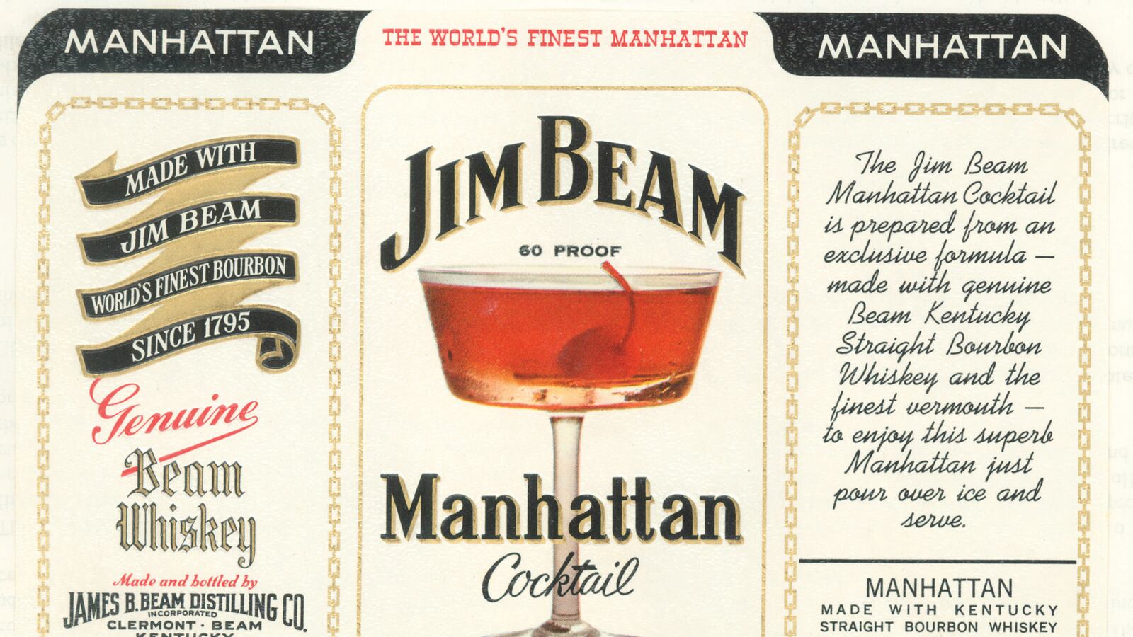
This 1969 label perfectly encapsulates the progression in liquor packaging design in the late-'60s, with a sleek Manhattan cocktail image, gold chain link borders, and modern font, while still paying tribute to the brand’s historic roots. Shortly after this, in the early 1970s, Jim Beam ran a print and billboard advertising campaign targeting baby boomers that matched groovy young stars of the day with older celebrities of the previous generation. One ad featured Orson Welles and his aspiring actress daughter Rebecca; another, Robert Wagner and Bette Davis; and a third, Dennis Hopper and director John Huston. The tagline for the series was “Generation gap? Jim Beam never heard of it.”

Bourbon Falls was the first whiskey sold by Heaven Hill, which started up right after the end of Prohibition. This striking Art Deco label was used in the late 1930s, after the company's founding in 1934. “Like so many other individuals of that era, (my grandfather) was a peddler and started off with a large pack of his back,” says the founder of Heaven Hill's grandson, Max L. Shapira, who is the president of Heaven Hill today.

The first step in creating a label is, of course, to hire a graphic designer to produce a mock-up. While that art is now generally made on a computer, back in the day artists would do it the old-fashioned way: by hand. Heaven Hill Distilleries has a collection of artists’ renderings, which were dreamed up sometime between its founding after Prohibition and 1946. While these concepts are quite striking, the company isn’t sure if they were ever used.
Heaven Hill Distillery
Fans of historic Four Roses could spot this ornate box decorated with its signature flowers on the pharmacy shelf. This particular bottle was prescribed to a patient in Sparks, Nevada, in 1924. According to the label, two ounces of whiskey were to be mixed with hot water. In other Four Roses ads from 1934, the brand touts not only the quality of its liquor (“blended with the finest whiskies, aged by Father Time himself in charred oak barrels”) but also the quality of its bottle “that makes tampering or adulteration impossible.” Both were real concerns for drinkers right after Prohibition.

While the Samuelses are now famous for starting Maker’s Mark in the 1950s, the family’s original brand was T.W. Samuels. This label from the early 1900s for the bottled-in-bond whiskey almost looks like it could be on a mirror behind a turn-of-the-century bar.
Samuels Family & Heaven Hill Distilleries