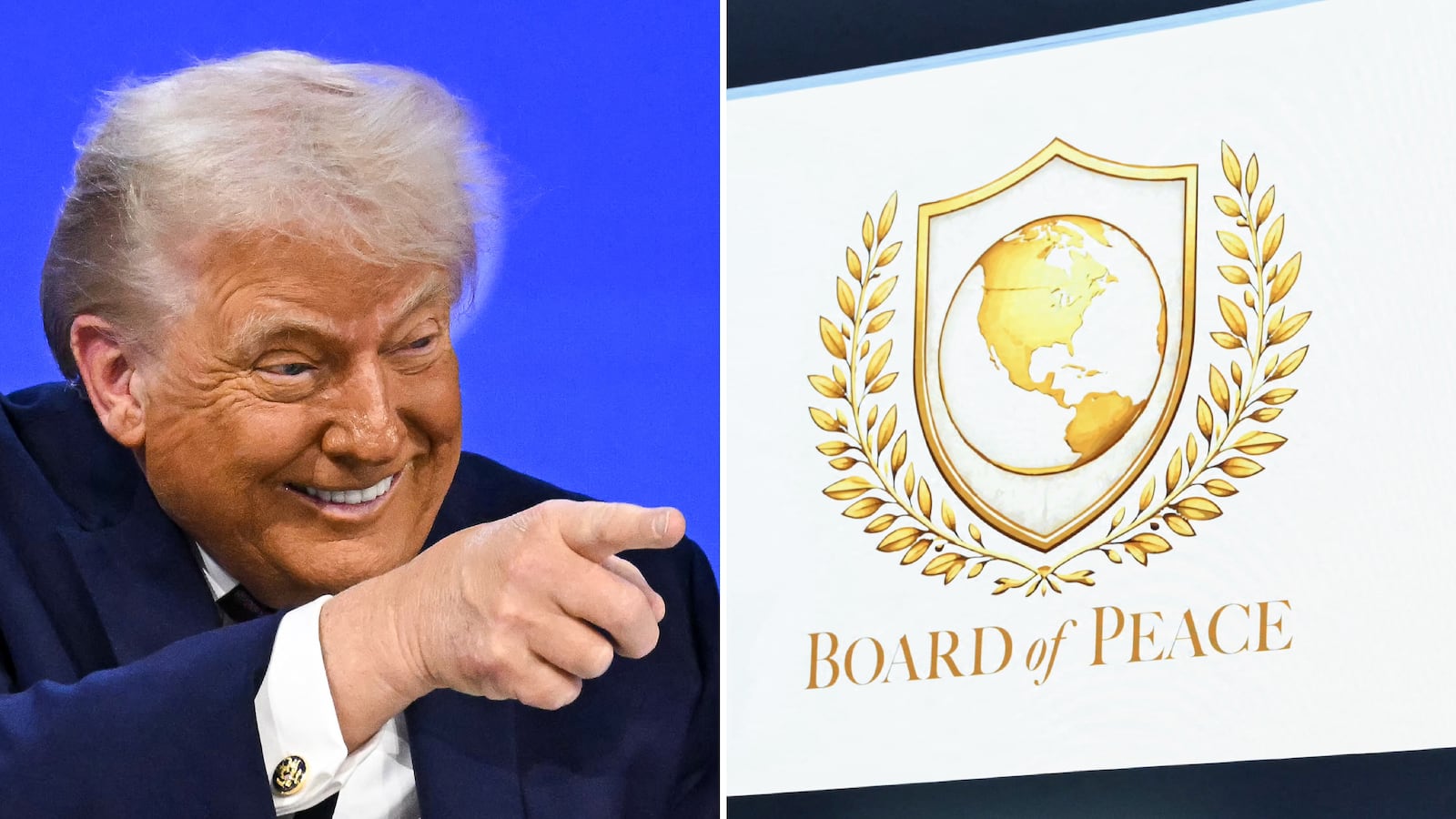
The logo of President Trump’s controversial new peacekeeping grift has been exposed as a cheap knock-off of the United Nations emblem smeared in gold.
The U.N. logo, designed after World War II, is meant to symbolize world unity and the quest for peace, featuring a map of the world on a polar projection surrounded by two olive branches.

Trump’s version, however, shows a map of the U.S. dominating the globe, with Europe not visible at all. Mexico and parts of the northern part of South America are just barely visible. Greenland, notably, is not.

Like the U.N. logo, Trump’s is also framed by olive branches, but it’s shaped like a standard sports team crest. In its most direct nod to Trump’s tastes, the “Board of Peace” logo eschews the U.N.’s blue and white palette for a golden color scheme.
The White House under Trump has similarly undergone a golden makeover, with the Oval Office decked out in gold trim, to the chagrin of many, including design experts. After the president added a tacky gold sign to the outside of the office, type designer Thomas Phinney told The Washington Post: “Trump typography is very consistent with many other things about the president. Whether you think those things are good or not is another question, but I think it’s part of a consistent package.”

Rep. Malcolm Kenyatta was less forgiving. The Pennsylvania Democrat wrote on X: “This sign looks like s--t.”
The president has billed his new peacekeeping body, which comes with a $1 billion price tag for any nations wanting permanent membership, as the “most impressive and consequential board ever assembled.”
However, the signing ceremony was decidedly unimpressive. It was attended by representatives from fewer than 20 countries, and none of America’s traditional Western European allies.

Trump delivered a low-energy speech for the event and had make-up slathered on his right hand, where deep bruising was visible. As he addressed the assembled world leaders, his logo was displayed for the audience.
The design sparked a wave of mockery and befuddlement among political observers who questioned the lackluster effort that had gone into it.
“Big Microsoft Paint energy,” political commentator Adam Schwarz quipped on X, noting that the wreath appeared to be clip art and the whole image was just the U.N. logo “except dipped in gold.”

Entrepreneur Arnaud Bertrand called it “beyond parody,” echoing others to note it “is basically the UN logo repainted in tacky fake gold and with ‘the world’ reduced to only North America.”
Critics also fear that the body is designed to rival the U.N. Security Council. The New York Times noted that it is evidence of Trump “dismantling the post-World War II international system and building a new one, with himself at the center.”